Intro
This week we were tasked with finding a print ad that displays the elements of good design that we’ve been learning about. I admit that I struggled a bit with choosing one…not because I couldn’t find any, but because there were so many to choose from.
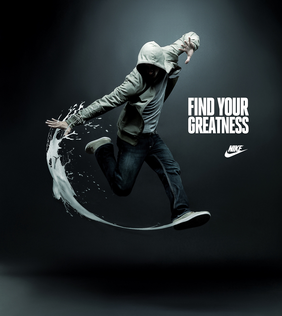
I ended up choosing a Nike ad from their “Find Your Greatness” campaign which depicts what I assume is a dancer. I actually found the image through a Google search, which led back to a Pinterest page, https://www.pinterest.com/pin/256705247484296415/?autologin=true. I couldn’t find any attribution for who the designer was, but I did find a press release on Nike’s website detailing the campaign. https://news.nike.com/news/nike-launches-find-your-greatness-campaign-celebrating-inspiration-for-the-everyday-athlete.
Contrast

This ad displays a wonderful use of contrast. The white text of the logo and slogan pop from the dark background and immediately draw one’s eye to it. While the subject has elements that fade into the background, the light shining on him, as well as the white shoes and paint line from his kick do a lot to break up the picture and create motion. The stitching on his pant leg shows great contrast from the rest of the leg and creates interest. The light also creates shadows on the background itself, and focuses attention on the subject.
Repetition
The ad also shows consistency by repeating elements of color. The logo and slogan are both bright white, as are the sides of the shoes and the paint swoosh. The corners of the page, the soles of the shoe, the shadow underneath the dancer, and most of the dancer’s face are also consistent by repeating the black. The paint line also creates a sort of repetition mimicking the Nike swoosh symbol.
Alignment

This ad shows good use of alignment by having the text and logo right justified. This creates a strong line for one’s eyes to go from the logo directly to the slogan. This also shows a good use of the subject being centered. I didn’t mark it, but the bottom of the Nike swoosh is also exactly aligned with the center of the page, which makes everything feel like it fits exactly where it should be.
Proximity

Here we can see that the slogan and logo are in close proximity, which delivers Nike’s message that Nike helps one to find greatness. The text is also centered on the middle of the dancer, which gives the impression that Nike is helping him to find greatness.
Color

The use of color in this ad is probably my favorite design element. While it’s a color photo, the shades of the clothes, text, and background almost appear to be monochromatic, which creates a really neat effect.
Conclusion
While it took me a while to find this ad, I’m glad that I did. I just wish I knew who designed it. The way the designer uses contrast, repetition, alignment, proximity, and color shows that they knew what they were doing and everything was well thought out and placed exactly where the designer wanted it. I’m not a dancer, but even still I can get the message that Nike is trying to impart.
