Intro
I love photography! I have worked in digitization for the last decade, and I really enjoy being able to use photography to capture amazing sights. This week we were tasked with finding 3 examples of photographic principles by a professional, and using the same 3 principles in photos we took. I used a Canon Rebel T2i with a 35mm macro lens to capture mine. Here goes!
Leading Lines

Photo by Sweet Ice Cream Photography on Unsplash
https://unsplash.com/photos/SEv2hWSCgi8
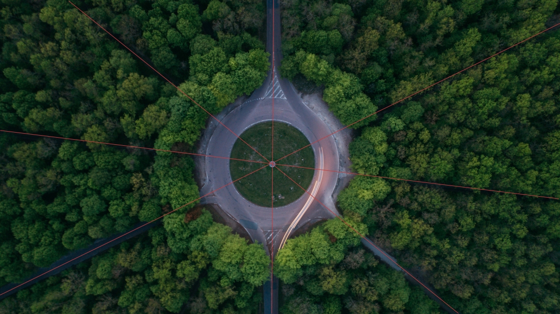
This photo is a brilliant demonstration of the concept of leading lines. Like spokes on a tire, the pathways all lead to the center spot. Even though the paths are covered by trees, there is still enough contrast to see that they exist. Both the paths and the perfect placement of the camera all lead the eye to the center.
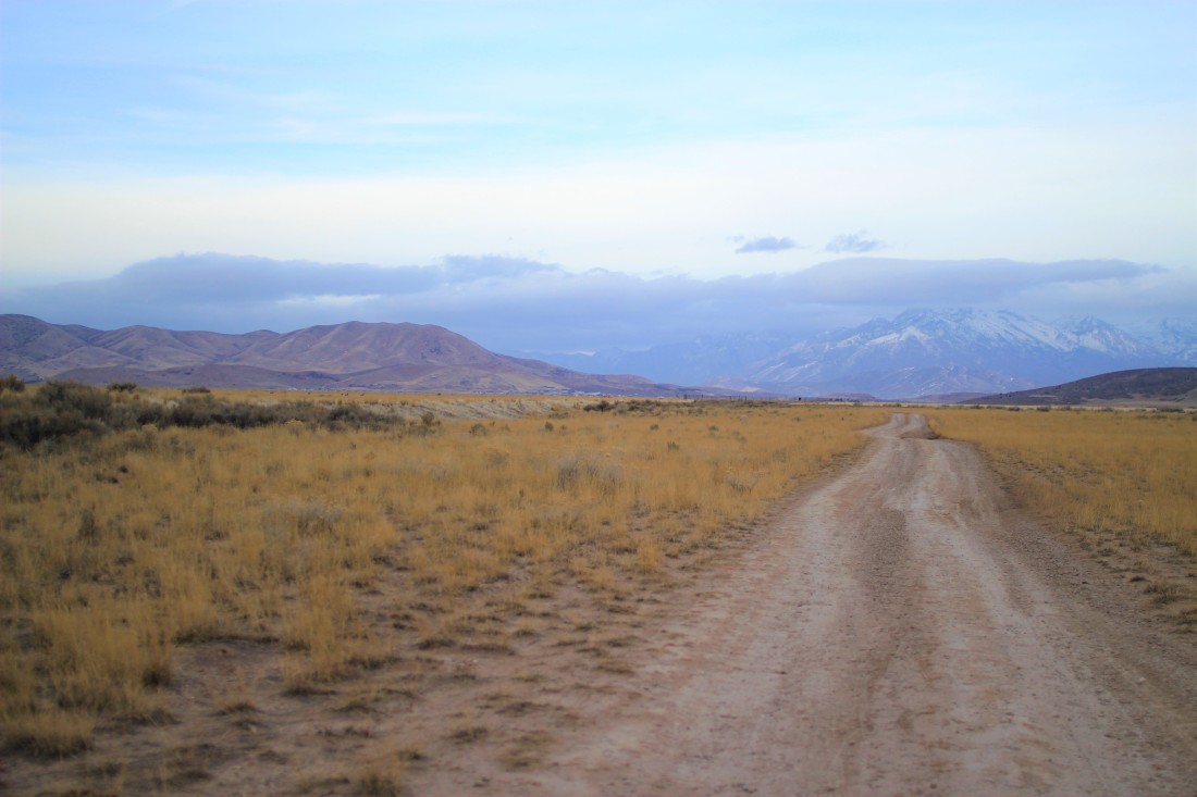
Photo by Tyler Harman (personally taken)

Here I chose a dirt road leading towards the mountains. Unlike the last photo, I decided not to center the road, but rather to place it in the right third of the canvas. You can see how the three linesm two from the road, and one from the horizon, all meet together in the center of the path. This draws the eye down the road and to the snow capped mountains.
Depth of Field

https://unsplash.com/photos/BiSFSSQtAmg
Photo by Marek Szturc on Unsplash

The photographer in this picture demonstrates excellent use of depth of field. How he got the dog to sit that still is amazing. Everything in the outline above, basically just the dog, is in focus. Everything beyond those lines is blurred. While we can tell that there are mountains and grass in the background, they all fade away so that we focus on the ice-blue eyes of this beautiful dog. Even though I chose this photo to demonstrate depth of field, notice the use of the rule of thirds. (More on that later.)

Photo by Tyler Harman (personally taken)

I took this photo of my daughter this afternoon to attempt to display the same technique. I set her body in the left third of the photo, with the scoop from the digger and the dump truck in the right third. Again, this photo is for depth of field mostly, but I wanted to combine more of the principles.
As for depth of field, my daughter is in focus, while anything outside of her is out of focus, to varying degrees. The bucket and dump truck to the right are slightly blurred, the fence more so, and the homes and mountains in the background are even more blurred. This all helps to draw attention to my daughter’s face, which is the subject of the photograph.
Rule of Thirds

https://unsplash.com/photos/f5QWC1a3tOA
Photo by Roman Logov on Unsplash
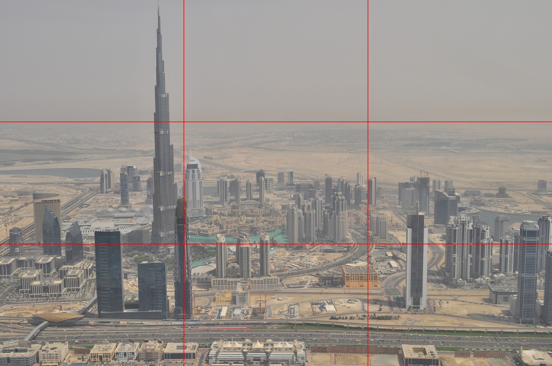
I love this photograph! It is brilliantly staged to display the rule of thirds. The tallest building is not perfectly centered on the left third line, but it’s close enough to do the trick. The top third is perfectly along the horizon, and there is a lot of interest and contrast in the bottom third. The eye is instantly drawn to the tall building on the left, and there is great use of “white space” towards the upper right.

Photo by Tyler Harman (personally taken)
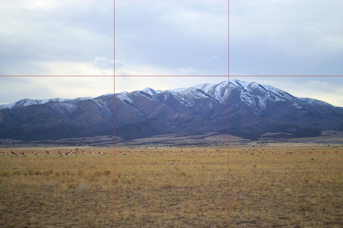
As I was driving around today looking for things to photograph, I saw some prong-horn antelope in a field. I immediately pulled over to see if I could get a useful photo, and I couldn’t be happier with how this turned out. The highest peak of the mountain is almost perfectly along the right-third line, as well as almost touching the top third, which is just sky. The bottom-third line goes right through the middle of the herd. I feel like there is some great contrast between the three horizontal thirds, and the eye is drawn from the top peak down and to the left, through the herd.
Conclusion
This week was a blast! I love photography and I’m always trying to get better. Using the techniques of Depth of field, leading lines, and the rule of thirds can be the difference between a ho-hum photo, and a brilliant one.